Top tips for livelier leaflets
How to make the classic A5 flyer work harder
Leaflets and flyers are a great promotional tool – they’re small enough that people are likely to keep them, you can include more information than on a business card and there are lots of ways to use them too.

Make yours work harder with our five tips for livelier leaflets.
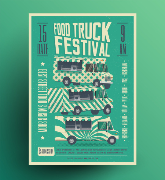
- Use bright, block colours– your leaflet should be eye-catching and impactful, and colour is a great way to achieve that
- Avoid too much text– people are put off by tons of text. Keep it short and sweet.
- Give people a reason to keep the flyer– for example, a price promotion, coupon or prize draw code, or discounted entry to your event.
- Think of the best time and place to hand them out– go to where you audience will be and catch them at the right time. Ask local venues or stores with a similar audience to have some of your leaflets on display.
- Upgrade for extra eye-appeal– make a lasting impression with quality that stands out. Print your leaflet on heavier paper stock, add soft-touch laminate for a luxurious finish and Scodix-digital embossing for a 3D feel.
We’re always delighted to chat about getting the best from your leaflets. Pop into your nearest store to ask about design and print, and to see some great examples to inspire you, or find out more online.